
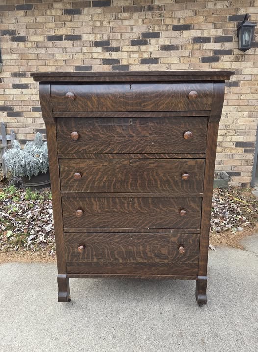
I was so sure it was tiger oak.
Not in a casual way—more like that quiet confidence you get when you’ve seen enough pieces to recognize something good when it shows up.
The grain had that movement. That depth. The kind of pattern that makes you pause a second longer before scrolling past or walking away.
And pieces like that… you don’t mess with.
You clean them up. You preserve them. You respect what they already are.
At least, that’s what I thought.
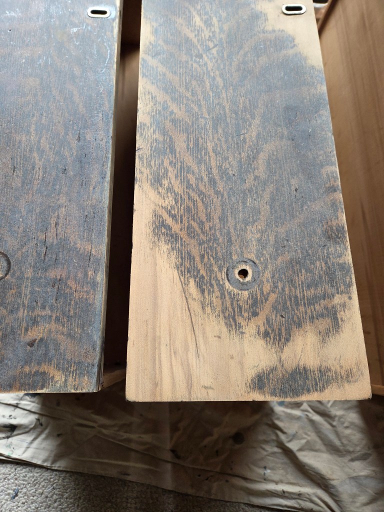
It wasn’t until I started sanding that I knew I’d find out the truth.
There’s always that moment when you commit—when you take the first pass and realize there’s no guessing anymore. Whatever is there is about to show itself.
And it didn’t take long.
This wasn’t tiger oak. It was trying to look like it. Really convincingly, too.
And that realization changed everything.
Because suddenly, I wasn’t holding a piece that needed to be preserved.
I was holding a piece that needed direction.
And that’s a completely different starting point.
There’s always a moment like this in a makeover. Where you realize the plan you thought you had… isn’t the plan anymore. And you have to decide—do you play it safe, or do you pivot?
And I knew if I leaned into it, I couldn’t treat this like a “just paint it” piece.
It had to feel intentional. Grounded. Like it belonged in its next version.
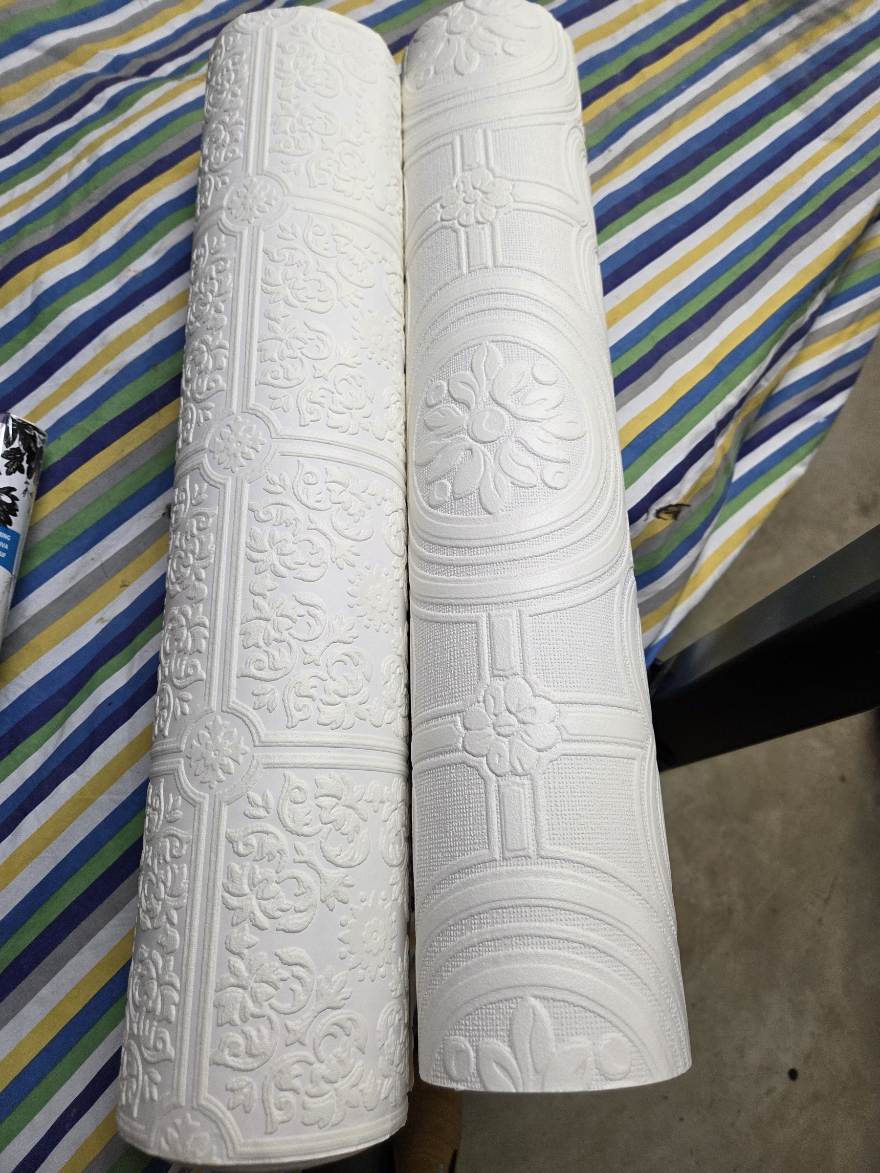
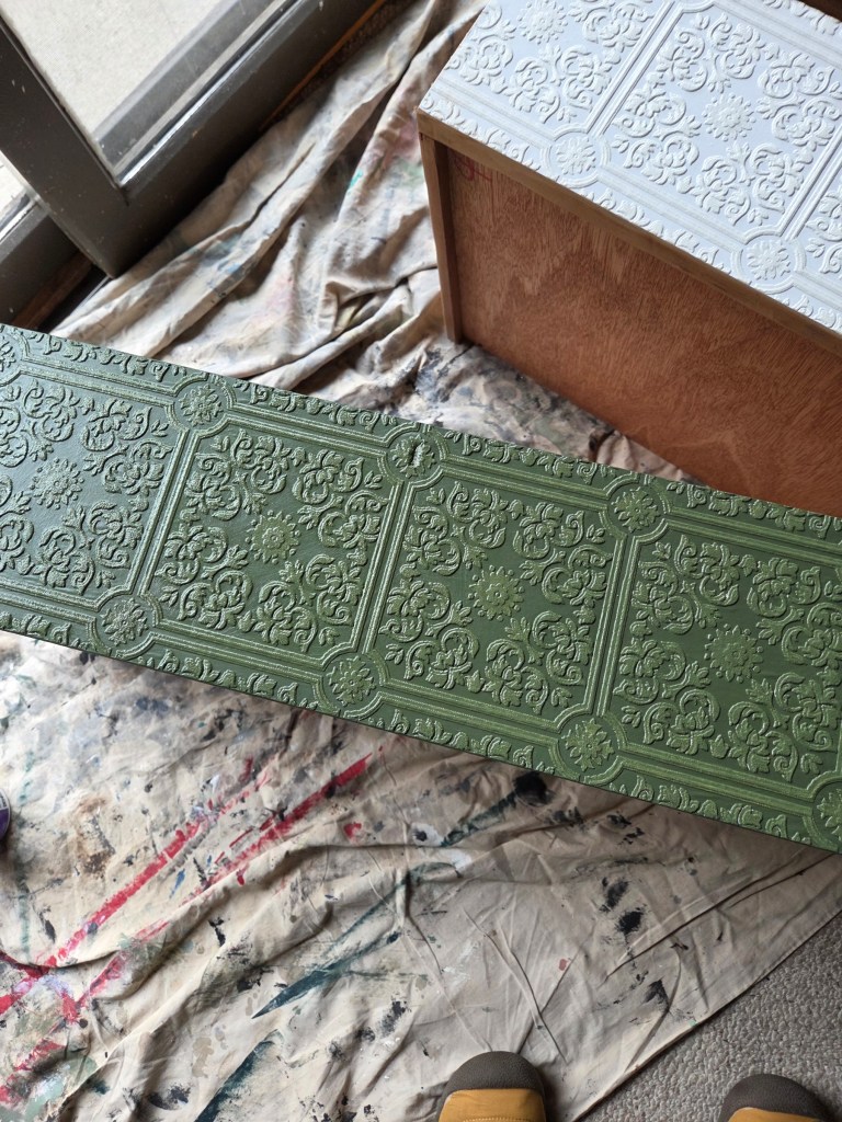
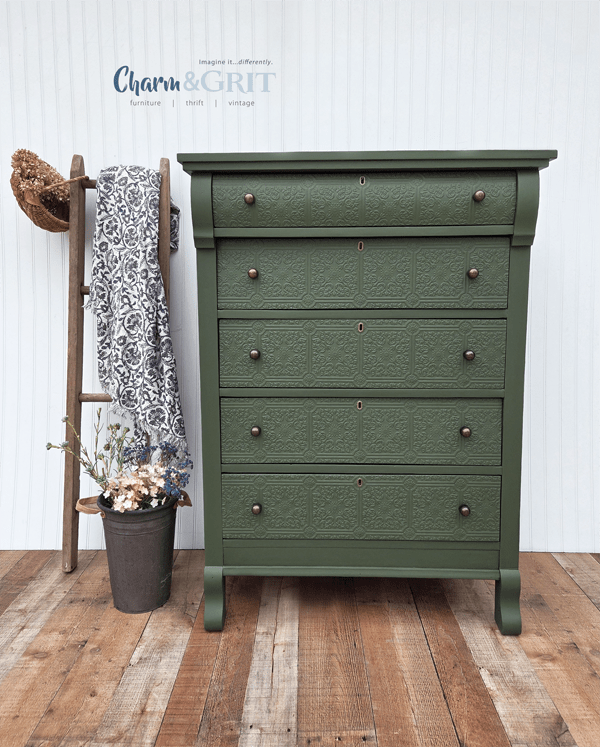
My first thought: the drawer fronts needed something more—something that didn’t compete but added just enough interest to break up the flatness.
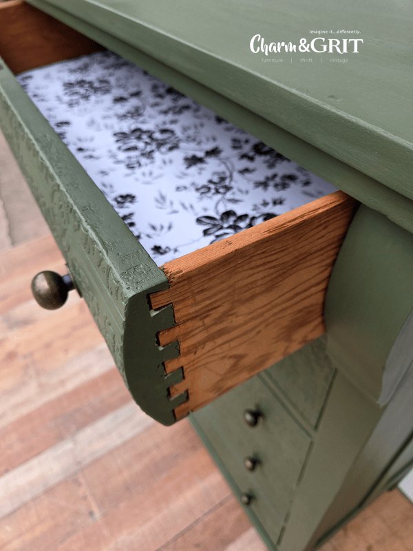
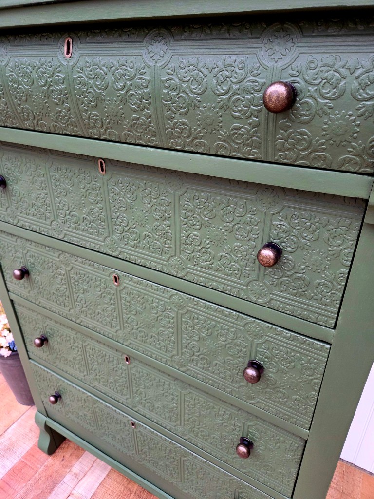
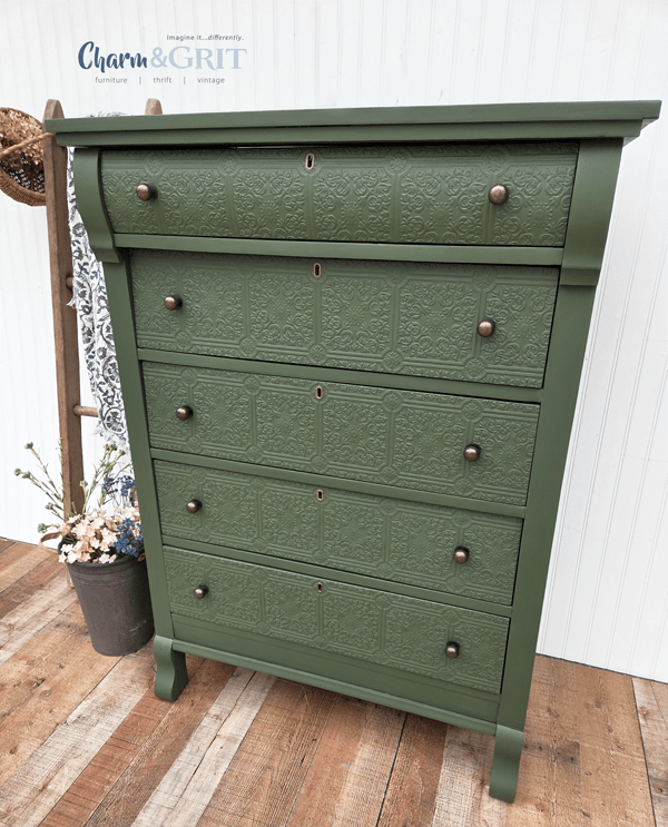
I had two embossed wallpaper rolls I found at a thrift store (always check the crafts section!). I decided this would be the perfect project. And that the smaller pattern of the two was best.
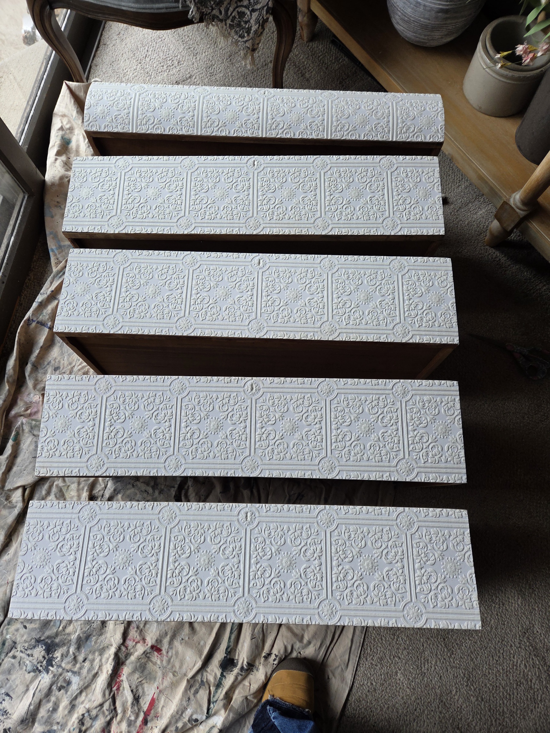
I also took the time to line up the pattern across each drawer—even with the different sizes—so the design flows all the way down. And I made sure one of the emblems landed right at each keyhole. It’s one of those small details you might not notice right away, but it makes everything feel intentional.
And then comes color.
Not a safe color. Not something that disappears into the background.
Something deeper. Richer. The kind of color that gives a piece presence.
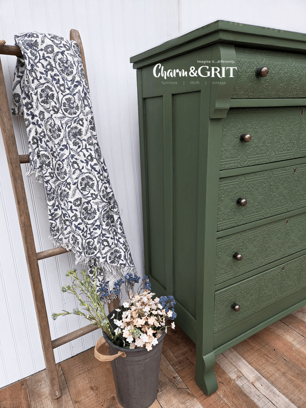
That’s when the green came in. A deep, rich green called Secret Garden by Sherwin Williams that I had Home Depot mix with my go-to Behr paint.
And once that first layer started going on, I could feel the shift.
That moment where you stop second-guessing and think—
Okay… this might actually work.
From there, everything else started to fall into place.
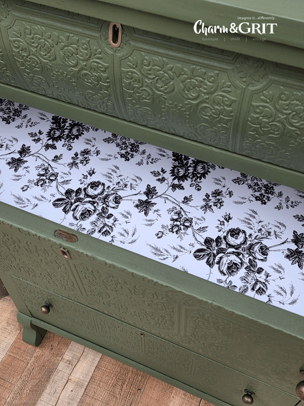
Including a use for some black and white floral drawer liner I found at the dollar store.
Just the right pop of contrast.
Sabine wasn’t what I thought she was when I first saw her.
But honestly, she turned into something better because of that.
It’s a good reminder that what you see at first glance isn’t always the full story.
Sometimes a piece looks like something it’s not.
Sometimes it feels like a risk to change direction.
And sometimes that’s exactly what it needs.
If you’ve ever stood in front of a piece wondering what to do with it…
whether to leave it, change it, or walk away entirely—
that moment of uncertainty?
That’s where all of this starts. And it’s something you can get better at.
If you want to learn how to make those calls with more confidence (without second-guessing every step), that’s exactly what I walk through inside my course.
But for now—this was Sabine.
And I’m really glad I didn’t leave her behind.
Does this give you an idea for a plain dresser in your life?
Imagine it…differently,
Kellee
See what’s next! Subscribe to my Blog to get future posts sent right to your email.
Copyright © 2026 Charm & Grit. All Rights Reserved.
