
This was so ironic! My dear friend asked me to redo a hutch she found on Marketplace, and it was almost identical to the donation project I did for my local Habitat for Humanity’s ReStore. See that amazing makeover in gray here.
She and her husband drove it up, and we chatted online about color, design, and YES! a wallpaper background. Bonus: I got to see my friend twice in one month!
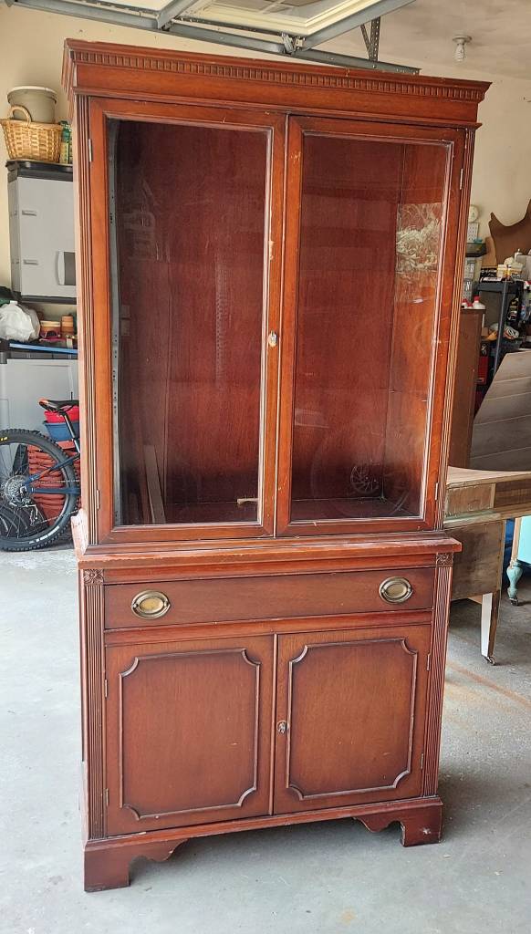
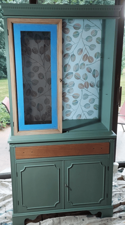
It didn’t have the curvy top or the fretwork in the windowed doors like the last one I redid, but it was the same petite size and linear shape. Here’s the BEFORE pic. It was in great condition.
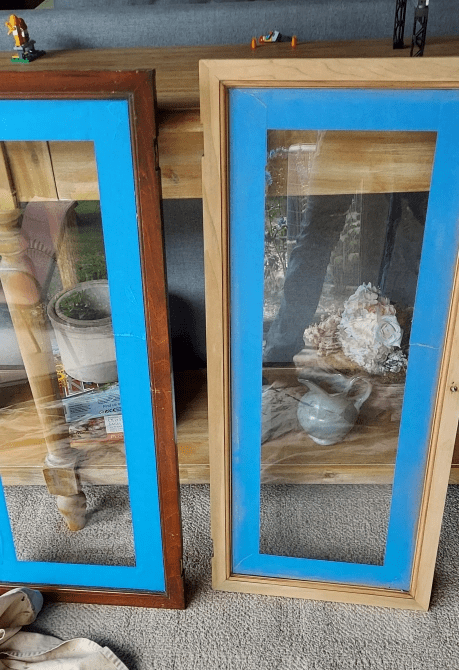
One thing she decided to do was have a bit of warm wood as part of the design, so we decided to do that with the door frames. But we didn’t want the old brown finish – we wanted a fresh stain.
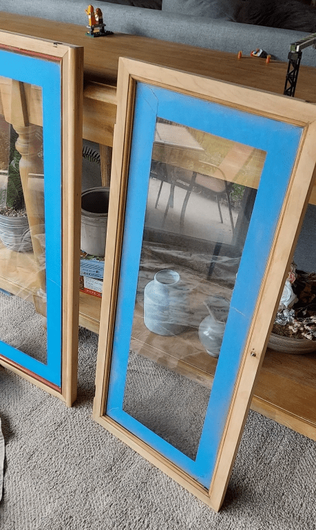
Before sanding the old finish from the frames, I applied painter’s tape on the glass. This would protect the glass from being scratched from my sandpaper. With such a small area, my best bet was to HAND SAND these.
You can see the difference in the first photo, while both finally match in the second. This part just takes PATIENCE.
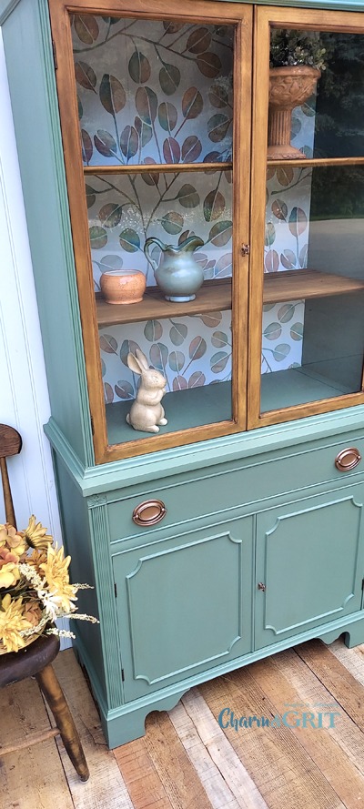
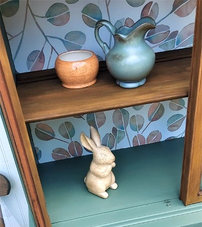
My friend sent me TONS of photos with different wallpaper samples. The really smart thing she did was place the samples inside the cabinet before she brought it to me. AND she even placed her dishes inside, so we knew what she wanted to display. That made a difference in terms of which paper would complement the items vs. distract.
Once we agreed on the print, she ordered the paper and had it conveniently shipped to my place. It’s peel-and-stick, washable, removable paper – so tons of flexibility with making this decision. Never stall on yourself fearing something is PERMANENT. Anything can be changed, honestly.
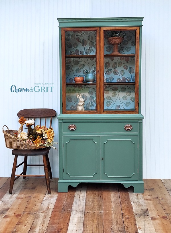
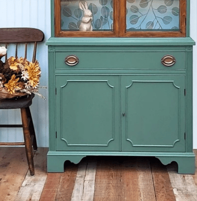
One big decision was the color of paint. She has lots of blue in her home with corals and grays. But she wanted something fresh and different, I think. We went with a green! Choosing the wallpaper helped us match a good shade.
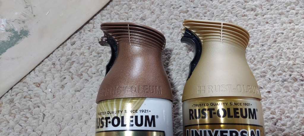
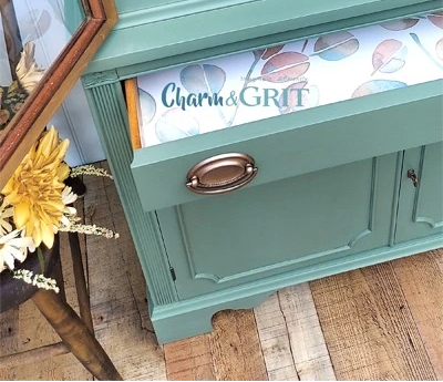
The next decision was hardware. We tossed around a Champaigne Mist or an Aged Copper. Because of the shades of coral/orange in the paper, and the warm stain that ended up on the door frames, the Copper was the WINNER!
It’s so exciting when you start putting all the pieces together. Seeing the door frames with the paper and the green led me to believe the bare wood should be stained a little darker, warmer color.
The FINAL RESULTS: don’t discount good attention to staging. The Copper was the right decision, don’t you think? It really plays off that warm stain.
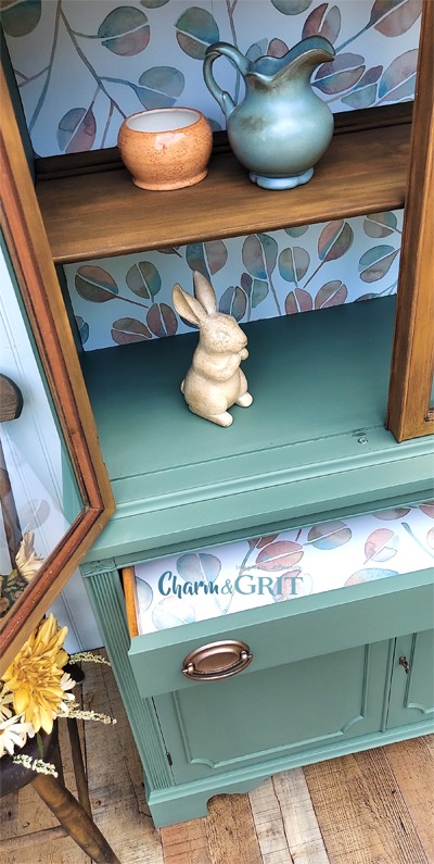
Attention to details matter. Since we had plenty of wallpaper leftover, I lined the top drawer as well.
Does this make you look at old hutches differently? Can you imagine the possibilities?
Imagine it…differently,
Kellee
See what’s next! Subscribe to my Blog to get future posts sent right to your email.
Copyright © 2023 Charm & Grit. All Rights Reserved.
