
I crossed off a big goal on my list near the end of this year! I’ve wanted to donate my time and skills in some way to give back. I discovered a perfect way to do this was to redesign a vintage furniture item and re-donate it back to the Habitat for Humanity ReStore for selling. Hopefully, this gives more toward their mission.
The very same day I spoke to the store manager, I saw a perfect candidate for a makeover. In fact, I’ve always had my eye on refinishing one of these display cabinets. It was a nice smaller size, too.
The furniture tag shows this is from Bernhardt Furniture Co, which is still in business in North Carolina. It’s also marked as coming from Gimbal Brothers in New York. Gimbal Brothers didn’t establish themselves in New York until 1910. I’m guessing this Sheraton-style piece might be from the 1940’s or so.

Lots of changes happened. Before reading more, can you pick up on the 8 things that were done?

- I asked my Facebook followers to help with the redesign. The first question I posed to them was whether to keep the fancy scrollwork at the top or remove it. They voted almost unanimously to remove it, so I did. At the same time, I removed the doors from both the top and bottom so I could prep the pieces.

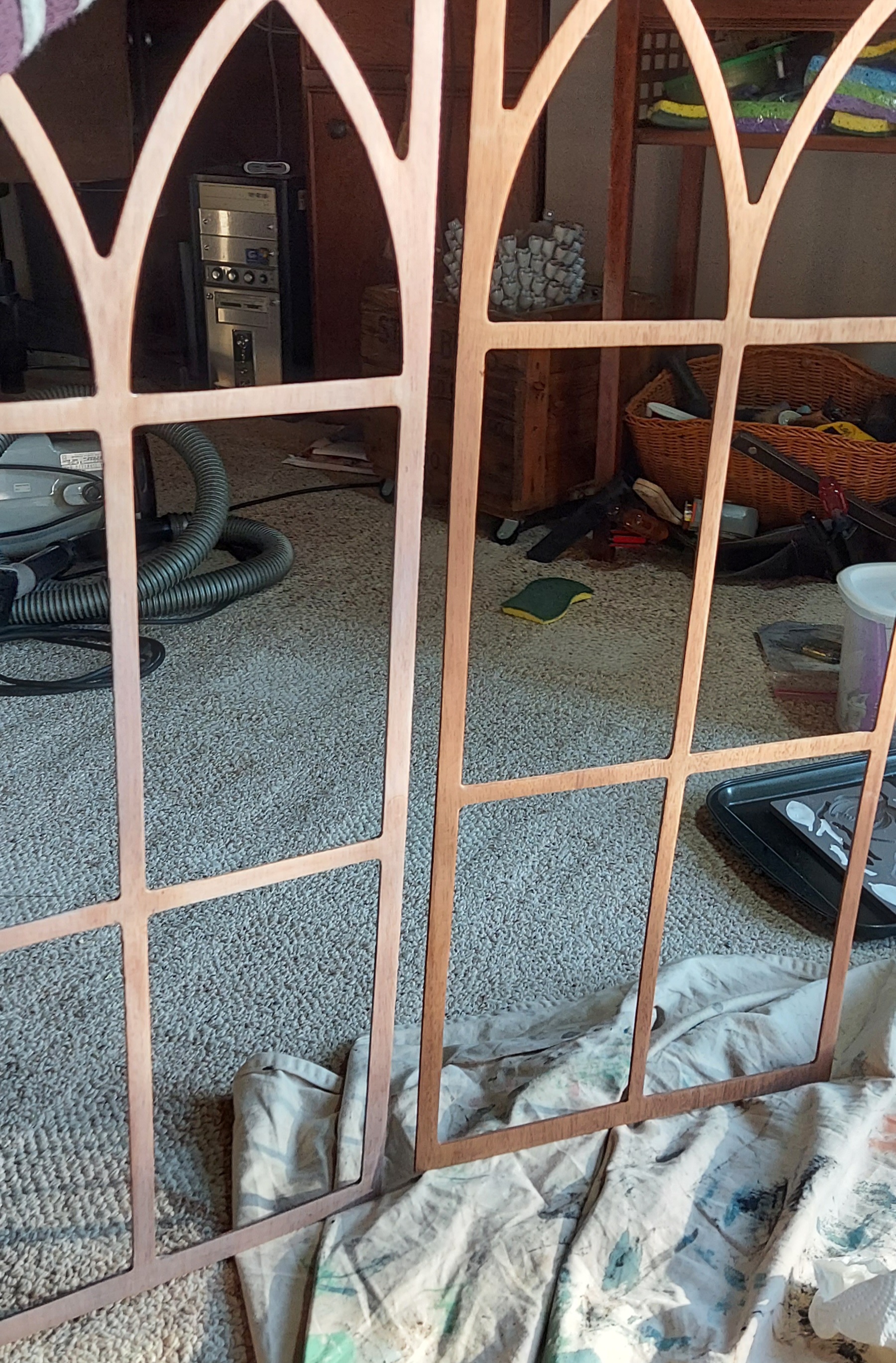
2. Second, I wanted to know if my followers preferred the detailed fretwork in the windowed doors, or a clean glass door for a more modern look. This received a mix of answers, but I had a vision of keeping the fretwork if the wood sanded to a much lighter, natural wood color. And that’s just what was done.
There was quite a bit of red/orange tannins in this wood, so I also used some paint wash of white & gray to lighten the fretwork (left of pic 3) even more for the look I wanted.


3. Whenever a piece has pretty turned wood legs, I like to highlight them by exposing the natural wood. In this case, the red tannins got the best of me by making the whitewash finish look a little pink. So I tricked the wood into doing what I wanted by using a heavier wash of a tannish cream mixed with less water to complement the fretwork color.
4. Obviously, a significant change was painting the piece in a pretty medium gray called Steeple Gray. The color is by PPG and I had it mixed with Behr Marquee paint. This shade is so nice, and it’s a pretty complement to the natural wood.
5. Speaking of natural wood, I also sanded both shelves to get rid of the dark stain and left them in a natural, lighter state as well. It provides a nice balance to the fretwork and front legs.
6. Besides the paint color, the biggest change may have been the pretty wallpaper inside. This peel and stick paper is removable and washable. It was very easy to apply. In my online search, this design was so close to what I had envisioned in my head with a simple leaf motif in gentle gray, charcoal, and tan colors. Just right for the design idea I had going! I found this on Kohls.com. I’ve included the name in case anyone falls in love with this and wants to find it. I’m actually contemplating putting it in my redesigned laundry room someday.


7. This next decision was a bit of an accident. My followers voted to keep the shell molding in the center since it was in good condition. It nagged at me, though, and didn’t feel right with my overall new design. I tried to carefully remove it to see what it would look like without, but that didn’t work well, and it ended up breaking apart. But when things go wrong, I assume it was meant to happen. To fill in that area, I created new clay moldings of leaves and twigs to mimic the wallpaper motif. I think it matches much better – do you?


8. Last but never least, you should always consider the hardware. My followers and I both agreed to keep the vintage hardware. I just wanted to lighten it for the design, so I spray painted them in Champaigne Mist by Rust-Oleum Paints.
It was SO much fun revealing the final results to both my followers who helped along the way, and the employees at the ReStore! I can’t wait to know it’s found a new home. UPDATE: this piece sold within 2 weeks of sitting out on the store floor, just in time for New Year’s!

Which change was the most impactful? I’d love to hear which one you liked the best!
I hope this inspires you to check out your local ReStore and give something from there a new life.
Imagine it…differently,
Kellee
See what’s next! Subscribe to my Blog to get future posts sent right to your email.


Copyright © 2022 Charm & Grit. All Rights Reserved.

8 thoughts on “Habitat ReStore Donation Project”
I found a similar cabinet… did those shelves just pop up and out? I feel like mine are in there pretty solidly …
LikeLiked by 1 person
Hi Jenn! Yes, the shelves did come out. They simply set atop some peg shelf brackets. If your shelves do not have brackets, it sounds like the shelves are built-in. Probably inserted into the sides of the cabinet and possibly glued. Removing them could do a bit of damage. Your best bet might be to paint the shelves or leave them as is if you can find a design that complements them now.
LikeLike
Ok, mine are glued in for sure… so I won’t be taking those out. I do have one more question… when working with the glass and scrollwork… I’m a bit afraid to take it apart… the back side of the glass and scrollwork are framed in … is that how yours was? Or were there screws?
LikeLiked by 1 person
I’ve found that the scrollwork is usually set behind small wood trim pieces that are held in place with pin nails. You can pry those trim pieces off the edges carefully with a putty knife or flat screwdriver (so you can re-nail them in) and the scrollwork should be loose. Do this on the floor because the glass is held in place by those trim pieces, too. This way you can keep your glass clean (set it aside someplace safe) while you’re refinishing the door frames, and even the scrollwork if you’d like.
If you don’t already, follow me over on Facebook for more inspiration and makeovers. https://www.facebook.com/charmandgrit.
I’d love to see your project!
Or you can sign up for my weekly emails (free thrifting tips included with sign-up) that has more pro tips and design ideas. https://charmandgrithome.mykajabi.com/pl/2147637491
LikeLike
Hi There, I saved this post a while back because I am redecorating my formal dining room and I loved the overall look you gave this piece. I’ve been on the hunt for a similar piece and yesterday I found it on FB marketplace for a very reasonable price. Once I got it home I read your post in full and found that my new/old find is a sister of this exact cabinet! It’s by the same furniture company and the only difference is that mine has a drawer between the hutch at the cabinet doors! I plan to start when the weather cools and it’s not so hot in my garage but I am so excited to have found it and wanted to share.
LikeLike
That’s amazing! I’m so excited for you. And glad I could be some inspiration. What have you decided for wallpaper and paint color?
LikeLike
I’m just getting started on exploring these options. This cabinet will be storage in my formal dining room, which I’ve painted with Sherwin-Williams sea salt. I have collected watercolor paintings of Charleston, SC since college so I would love to find a wallpaper that has notes of the bright home colors from rainbow row there with a nice muted coastal tone for the outside maybe. We just refurbed the dining table in there which was another amazing find on FB marketplace.
I will be sure to share when we get it completed 😊
Kindest Regards, * *Rebecca Ellison, MSW
LikeLike
I would love to see it! Sea Salt is a great color that will complement the light wood details.
LikeLike